Home Vita Portfolio Glossary Training


An Applications Engineer for


Industrial & Technical Markets

Gaining Insight
Building Trust
Explaining Better
Reducing Costs
Saving Time
Avoiding Mistakes
Selling More


Examples of Technical Illustrations


Symbols

The most basic element of most diagrams. They represent concepts and devices that are more complicated than the symbol image itself. Symbols need to be as simple as possible, but also need to be detailed enough so that they can be differentiated from a dissimilar device or concept that may be in the same diagram. Symbols also need to show where connection points are clearly and precisely. OEM's often create specific symbols for each of their products for use in applications stories or reference designs.

Flowsheet

Also known as a Process Flow Diagram or PFD. Sometimes called a Visio, after a common software tool used to create them. Illustrates a production process by showing the sequence of steps followed. Each step is depicted by a symbol, picture or text block. Arrows indicate the order of each step.
Flowsheets are often used to specifically show "We Can Help You Here" by indicating on a flowsheet where products or services can be applied.

Ishikawa

Also known as fishbone or cause & effect diagrams. They are rigorously stylized mind maps that focus thought in a desired direction. Focus & clarity is accomplished by pre-directing thought towards specific areas (main axis in the diagram).
One framework is Man - Machine - Material - Method, another is People - Procedure/Process - Parts - Plant. The specific framework is not as important as populating each branch thoroughly and in depth (five whys).


Block Diagram

Used by itself or as the first step in creating more complex diagrams. Works best when block order and paths follow the writing direction of the culture consuming it. In the Western culture this would be top down & left to right. Care should be taken to minimize crossed and convoluted paths.


Interconnect Diagram

The next step in detail and specificity beyond block diagrams & flowsheets. This diagram focuses on showing what is connected to what and where the connections are made. It goes beyond a general concept and shows viability and credibility to the solution being presented.

Flow Process Chart

Different from a flowsheet as the symbol for each step only describes the its function: Production - Inspection - Movement - Storage. Originally used for time-motion studies, it is very effective is showing a complex process in a small presentation space. Can be used to believably show messages such as: "What we do for you is very intricate", "We take care in what we do, by inspecting our work in many places". Especially effective in 8D presentations.

Quadrant Chart

Simple to understand but a very powerful method to communicate situational awareness. Also known as a 2x2 Matrix diagram. They are best used is situations where the data is highly ambiguous with uncertain boundaries, but where an identifiable pattern can still be found.

SWOT, Growth-Share Matrix and Eisenhower are well known versions. Its spartan form has let it be used for many simplistic concepts that produce meaningless charts. However, with some thought and proper application, certain complex concepts can be revealed effectively.

Organization Chart

A simple but powerful extension of a spreadsheet where each entry is given a parent and as one of its attributes (columns). With this information a tree structure is created and can then be illustrated. The most common application is an organization chart or genealogical family tree. But other useful applications are available.

A complicated assembly can be represented by a Bill of Materials (BoM) that can include manufacturing, materials compliance, testing, and design information well beyond just a shopping list. A linked list is a foundational concept in a database and the graphical representation of data in a "org chart" manner is helpful for greater insight.

Mind Map

A powerful method to capture, organize and display ideas in real time as they are generated by individuals or teams. One can let the ideas flow freely or focus them with a predetermined specific framework of "axis" like in an Ishikawa.

Not well known, but very useful, is that the same diagramming tools can be effectively used to create a graphical overview of pre-written documents such as lengthy specifications or regulations making them much easier to consume.


Euler Diagram

Original created for mathematical logic and set theory, these diagrams can be adapted to show the preferred zones of application of a device using non-numeric attributes.
Base Image: Ashby diagram of strength versus maximum service temperature.
Doggo3, CES EduPack, CC BY-SA

Ashby Chart

A series of charts used for material selection. Existing charts with general material data can be overlaid with specific application data. Zones of desired or required performance can outline decision choices. Points plotted for specific materials can demonstrate sound decisions. Make your point clear without reams of numerical data.

Timeline

Time is a driving force in many important stories to be told. Graphically showing actions over time conveys a lot of information in one glance. A very effective way to analyze massive log files. It has various versions like timing diagrams and sequence of events (SOE). Can be a single static image or can be a sequence of images making an animation for even faster understanding of complex events. When applied to a website using an SVG based timeline, the constraints of physical paper are lifted and long period intervals or high density information can be easily displayed and viewed.


Supporting Image

Illustrations to add depth and good feeling to your work:
  • Designed by technical people to minimize glaring mistakes that will diminish your credibility
  • Providing an increased portfolio of images specific to your products or services
  • Messaging that is bright, positive and business professional

Map

After time, location is the next most common part of a story needing to be told. Locations may be across a continent or spread around a plant floor. Seeing data in the context of location is useful from sales all the way to failure analysis and many things in between. Clutter avoidance and clarity are important attributes of a good map.

Google and other online platforms provide much of the heavy lifting baseline geographical and street address data needed to make a map. Obtuse GIS software and importing large data sets are no longer needed to create many illustrations.

Timing Diagram

The logic used in industrial process can be quite cumbersome to comprehend when view in its native code. What causes a process to start, stop, or change is of concern to many roles in a plant even if they are not going to program the control device themselves. Graphically showing the triggers that change the state of a process exposes any misconceptions and clarifies the situation to bring a knowledgeable consensus among all plant staff roles.


Where Technical Illustrations Are Used


Quote

Quoting takes up valuable technical staff time. Too many quotes are made but never considered by the customer. Quotes that are hard to understand are often filed away and then never turn into purchase orders. Diagrams can show the context of what is being proposed. Before and after diagrams can make clear what changes are being proposed. A quote that is made to be accurate and precise may also land up being very intimidating for anybody not directly involved in that part of the business. Approval for spending is often in the hands of executives who, although very smart, do not have the detailed knowledge of the situation to comprehend a detailed technical quote. Diagrams can help those executive feel comfortable saying yes.

8D

Sooner or later bad things happen in business and then customers get upset. Ford and Motorola developed a solid methodology to manage recovery from such problems. In every step of the 8 disciplines, illustrations can help discover root causes and explain solutions to them.

Instead of telling the customer you did or will take care of a problem, well designed illustrations can show why the problem occurred and how you have/will solve it. Trust can be built easier when the message is clear and easily consumed.

Theory of Operation

This document type is ideal for capturing design intent and providing the foundation for troubleshooting. For the highest effectivity in comprehension, the illustrations in this kind of document should span the range of abstract block diagrams down to detailed realistic views.

Knowing what illustration detail level is needed at which point in the document is best achieved by someone who has been a consumer of such documents for testing, maintenance, managing component obsolescence, failure analysis and design reuse.


Procedure

Well crafted procedures are a significant asset to an industrial operation. Once in place, they ensure consistent quality and minimized losses over time. They are a necessary foundation for any process improvement and provide speedy disaster recovery. Procedures make onboarding of staff faster, which allows an operation to capitalize on a business opportunity before it disappears. Clear and constructive illustrations enhance a procedure's effectivity.

RFQ

Vague requirements lead to padding a quote with extra cost to make sure the vendor does not suffer a loss due to misunderstandings while making sure the customer is satisfied. Fear, uncertainty and doubt generally make the size of the pad much larger than needed. Fuzziness in an RFQ will also make the experienced vendors you want participating to decline bidding as they avoid unnecessary risk. RFQ's written in the way a vendor would understand can lead to significant cost reductions in the initial quotes. Effective illustration in RFQs are an up front investment that pays off a high ROI in the medium to long term.

Specification

Supplier consistency can be achieved by clear specifications that leave no room for misinterpretation. Vendors find it very difficult and costly to comply with requirements that are not well defined. Diagrams can make things very clear. But both diagrams and text need to be careful to avoid taking things for granted and assume that the readers will certainly know what the author is thinking. It also defeats the purpose of a specification to leave determining what something means by leaving it to the relationship between the representatives of the customer and the supplier to figure it out between themselves. Diagrams are generally very useful in specifications, but they and the document need to assume nothing and define everything.
Examples to the Contrary


Brochure

Even in today's digital age, there are times when leaving something physical but easy to consume is needed to be get your point across and be remembered. E-mail is too often ignored and never opened. Websites are never visited and videos never watched.

Sometimes you need to put something physically attractive and compelling into someones hands in order to get your message noticed. A brochure fits this role nicely. Nobody has time to read lots of text so illustrations can catch their eye and convey much of your message. Diagrams give the opportunity to not only Tell but also SHOW the what, where and how your product or service is applied.

Website

The best and longest lasting SEO strategy is good content. Instead of your team constantly trying to keep up with search engine algorithms, The search engine algorithms are working to keep your great content on top of all the other distractions that their customers (which are also your customers) want to see. Effort spent on great on-topic content pays off immediately and long into the future. Great content can also be reused in may other places to get even better ROI.

Populating a website with compelling images is not easy, but one can find a lot of assistance from the many stock image services on the market. This is unless your are doing something industrial or technical. Then, the selection choice of images is sparse and the search terms turn up some completely off-topic offerings. That is when a graphics designer that specializes in technical and industrial topics can be extremely helpful.

White Paper

As an authoritative report that is meant to help readers understand a specific issue, solve their problem, or make a decision on how to best invest their capital budgets, your white paper needs to be compelling. Diagrams and illustrations can make that happen.

You completely control the content of your white paper without any editorial review from third-parties which may have different agendas. However, that does not mean a neutral editor is not needed. Credibility comes from a impartial treatment that gains customer trust.


Textbook

The tremendous effort expended to create a textbook garners significant trust and respect. But, few publishers venture into industrial technology subjects. Often the potential sales quantity dissuade the usage of lush graphics that are now commonplace in more mainstream technical volumes. However, the need for a qualified workforce creates a strong need for high quality training material.
Photographs are very useful, but many industrial environments are compact and the essential equipment to be illustrated can be lost in the co-location of other subsystems in the same view. Drawings can help isolate the essential points to be made. One can sometimes get the best of both worlds with an overlay drawing on top of a photograph that shows the viewer how to mentally sift through the clutter that is the real world and gain process understanding.
Some industrial publishers prefer to stay in a black & white illustration format for better ROI. While color works very well, it is also quite possible to get most information expressed in a line drawing. It is just a little more care and effort.

Application Note

Customers that have enough money to purchase your products or services are generally quite busy people. They do not have much time to figure out how to configure and use something. Providing plenty of reference designs with interconnection diagrams populated with symbols of your products and services gains customer faith and trust that they can make it work with you as their supplier.

Experienced managers are often willing spend more to make sure a project gets completed rather than be stuck with explaining why there is a pile of inexpensive parts still lying around on the books. One successful project encourages a customer to repeat the experience with other problems around the plant. The closer one can get to being able to provide a cookbook or kit, the more one can acquire satisfied customers and repeat business. The higher the skill level needed to implement your product and services, the fewer people who will be willing to attempt the work.

Application Idea Book

In the fast changing high-technology market, getting a customer to switch suppliers is real tough. Once a design is done and making money, nobody wants to touch it again unless they absolutely have to. Instead, customers are on the constant prowl for suppliers who will give them a big edge on their next generation product. You have no idea what that application will be. Your customer most probably does not have a full idea what that application will be either. So how can you get invited to the design table and get a shot at print position ?

Unlike a reference note, an idea book does not have fully worked out designs. Instead it has a series of exciting and inspiring ideas how your product can be used. Only the part of the design where your product is has to be solidly capable of working. The rest can be plausible fantasy or wishful thinking and is there only to get the creative juices of the customer's designers working in your favor. Making it or something else like it real is the job of the customer's design team. The art of making a good idea book is to get close to predicting the future with just one of the ideas shown. The one idea that will get the customer to invite you to the table.


Blog

Blogging is about getting attention, especially from Google's search engine. Google spends all its efforts to sort quality blogs from weaker ones. Blogs with high-quality on-topic illustrations that support the subject being discussed get eyeballs. Spending time optimizing for Google may be less productive then spending time making quality content that Google will spend time and effort finding and promoting.

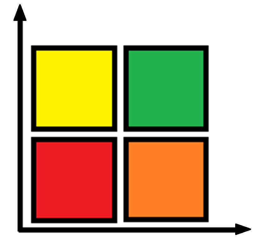
Illustrations encoded as SVG are indexable, whereas bit-mapped graphics like JPG & PNG are not. Thus when needing to annotate on top of an image, it would be better to use a vector program to do the editing and export the result as an SVG. Using a bit-map editor to add text and arrows will only just produce another bit-map image. Changes to JPG or PNG done that way are uneditable and the result is unsearchable.

One the other hand, don't go to extremes and make everything an SVG. Captions and the main text of your blog should be left in HTML. There is no one tool or format that is best for every task. There are many good tools out there and each has its strength and weakness.

Article

If you have been tasked with writing an article, you may find yourself in a position of have very little to say or when you finally get the flash of inspiration that explaining your point is now taking way more than the word limit set by the publication.

An alternative approach to using just words is to start with some illustrations and make captions for them. If you have picked interesting illustrations, your captions will start to expand into paragraphs. As you compare one illustration with another you are linking them into a whole experience that benefits the reader. If the article gets too long it is easy to break it into chucks of one or more illustrations and their lengthy captions.

As you write the caption for an illustration you may find that it does not illustrate all that can be said. Thus, you have the basis for commissioning a new illustration to fill in the gaps that existing illustrations don't cover. For some people, this path of construction is much easier and provides deliverables that you can mix and match for differing publications that will allow you to get a wider audience exposure while pleasing editors with eye catching content for their magazine.

Post

In the industrial world the dominant social media platform is Linked In. Many people only repost other people's material but still think that will get them noticed in some positive way. Instead, they are just acting as unpaid salespeople for the original content producer. Create compelling original posts and let others repost your work. Content creation is hard work and creating compelling graphics takes a lot of thinking. But, it does bring its rewards.

Even on LinkedIn, the posts are mostly very "social" in nature. That means any decent post that is about practical technology or a real world situation in a specific industry will stand out. Focus on what people want to hear about rather than what you want to say. Try to make the analysis of your subject deep. 
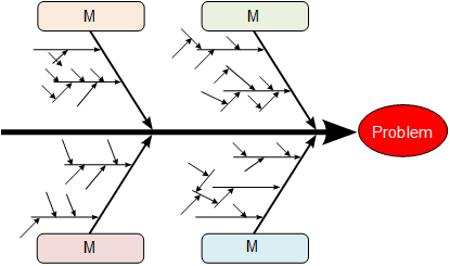
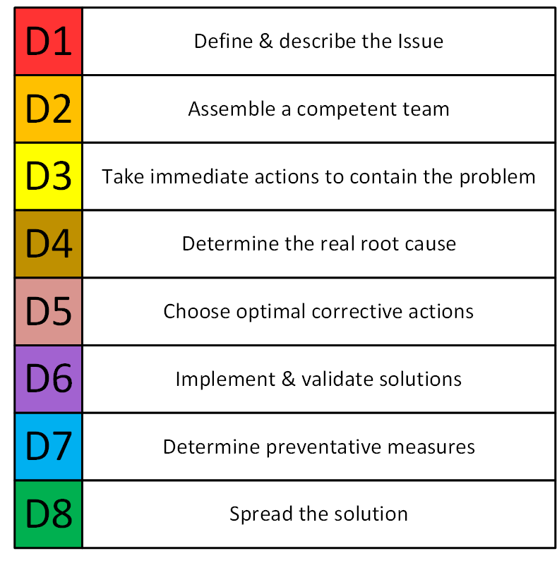
Consider using the 5 Whys methodology to brainstorm aspects that will demonstrate your authority on the subject.

Don't forget to add some cool but meaningful graphics into your post.


Advertisement

The Golden Rule in Advertisement and Sales is: "Don't Tell Them, Show Them." Well planned and constructed diagrams go a long way to Show. Most advertisements and sales pitches just Tell, because telling is much easier than showing. A lot of effort is spent telling with very little to show for it in results. Spending time ahead of making your pitch to really Show can make better and faster results. If it was easy to Show everybody would do it. It is not, but if you spend the effort, you can differentiate yourself from much of your competition.

Contrast telling the world that your products can work almost in any application with 
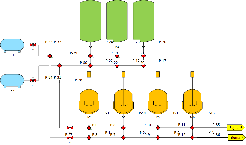
showing on flowsheets for different industries exactly where your products and services can be used. One will get glazed eyes, the other will get noticed by those in the industry you have illustrated your presence in.

By answering as many questions your reader may have about your pitch, you inspire them to make up new questions and engage you with them.

Presentation

Presenting is selling. Internally or externally, when you present you want to make a point to your audience. 
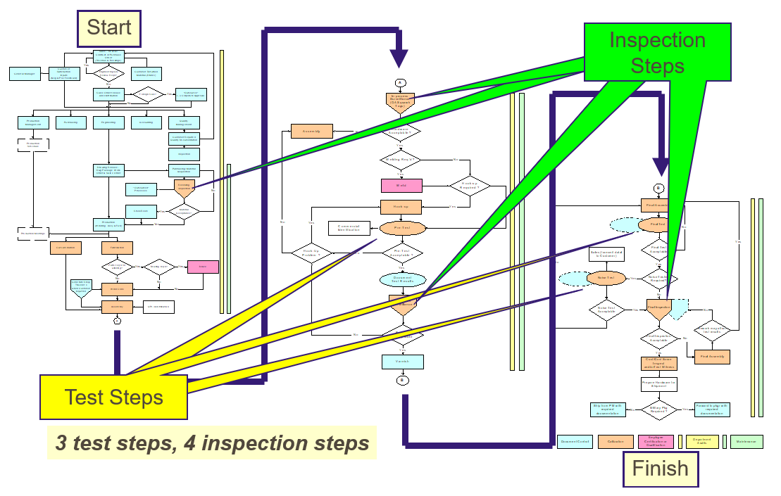
If you are reporting on a situation, why not have an underlying illustration of that environment the situation refers to?

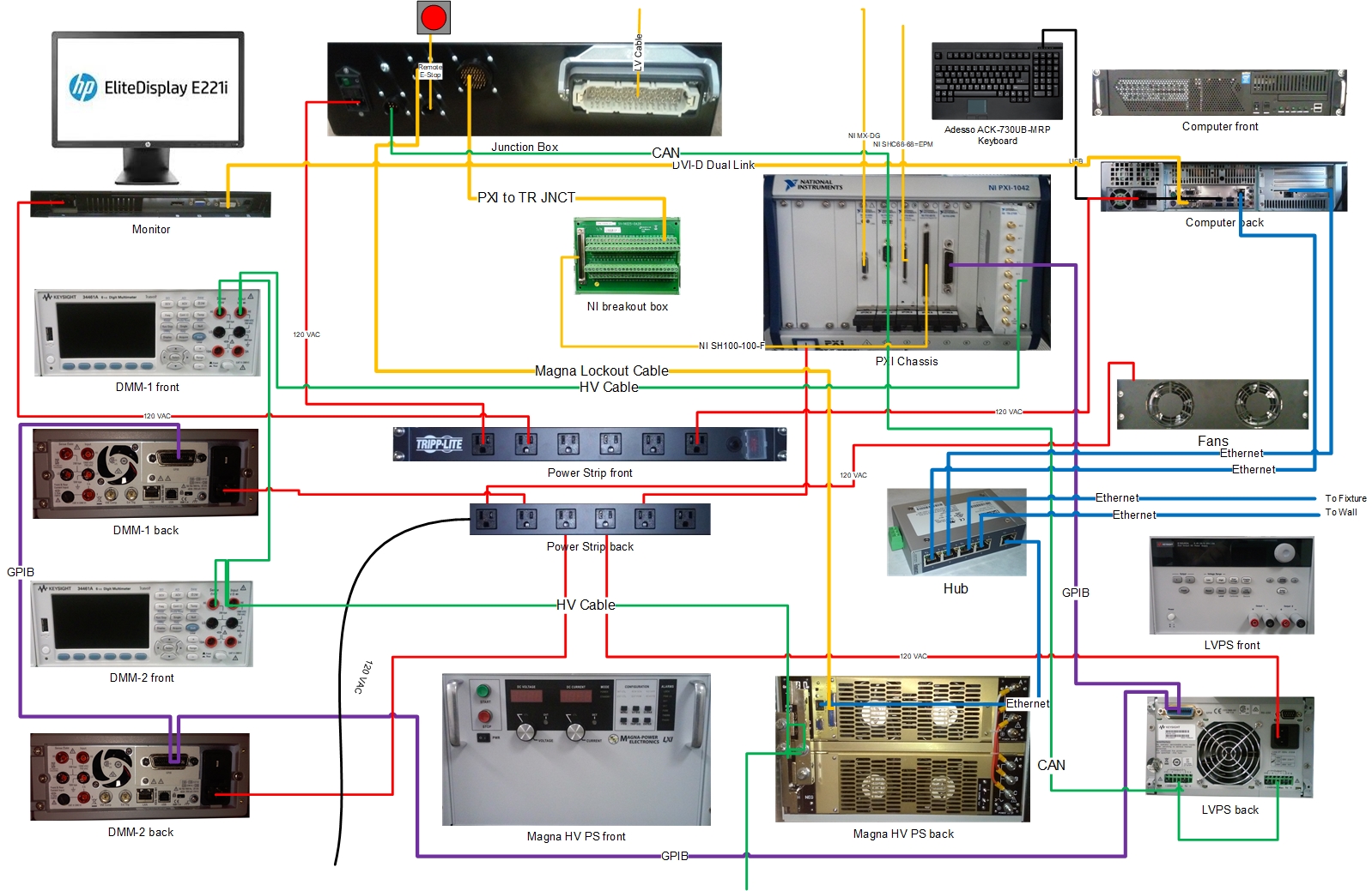
Block diagrams, interconnect diagrams, and flowsheets make great backgrounds for you to show what you have been doing, where it is and how it relates to the big picture of the business. By reminding your audience of the context of your work you can be way more efficient in communicating your point. You also will most probably not get grilled as much from confused management.

Beware of relying too much on bulleted lists. After making the first pass of your presentation, examine each bulleted list and ask if there is a better graphical format that could convey the information better. Yes, it is more work. But it also will impress your audience with the fact that you value their time and have had the consideration to spend your time making their time easier and more efficient.

Signature

Like most people you have to respond to numerous e-mails every day. While you have got their attention since your are responding to their query, you can sneak in a bit of your agenda, by including a tasteful but compelling signature graphic. It is a miniature advertisement that you can use to get people to consider something new.

To keep from annoying your correspondents it is important that your signature graphic be interesting, unusual, educational and if possible visually stunning. Avoid the temptation to break your catalog down into small chunks and send it out this way. Unless you do way more than just a datasheet entry, it will be boring and be ignored. To keep them paying attention, it is important that you have a new signature graphic for the next e-mail they receive from you. That does not prevent your from repeating a signature a little while later, but variety will keep your readers from tuning out. Each signature should have a link to a landing page for the point you are trying to make. This will take a bit of planning, but results can be significantly in your favor.